
Overview
Mimi is a multimodal AI assistant concept created for older adults at the Koreatown Senior and Community Center. The project began as a mobility challenge, but our research quickly showed that the deeper issue was service access. Seniors were not only struggling to get to the center. They were often making difficult trips just to find out whether lunch was still available, whether a class had space, or whether someone could help them.
That uncertainty created a high friction experience for people already dealing with mobility limitations, long transit times, limited English proficiency, and low confidence with digital tools. In many cases, seniors had to spend time, energy, and physical effort before even knowing if the trip would be worth it.
Our team designed Mimi as a voice and chat based assistant that helps seniors check updates, explore classes, register for programs, and get support from home. Instead of building a generic chatbot or simply redesigning the website, we focused on a behavior seniors already understood: asking for help through a conversation.
My contribution focused on UX research, journey mapping, prototype design, usability testing, and shaping the final story around access rather than transportation alone. The final concept became less about replacing the senior center and more about helping people feel informed before they needed to show up in person.
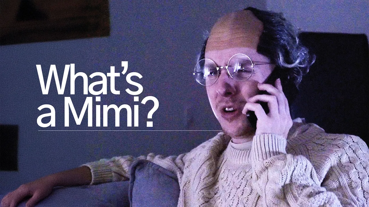
We produced a short video that follows James, a lonely senior living in Koreatown, as he navigates the center’s outdated system and discovers Mimi. The video demonstrates how Mimi helps him explore classes, receive real time lunch updates, and rekindle his joy for dancing, all without needing to stand in line or struggle with forms.

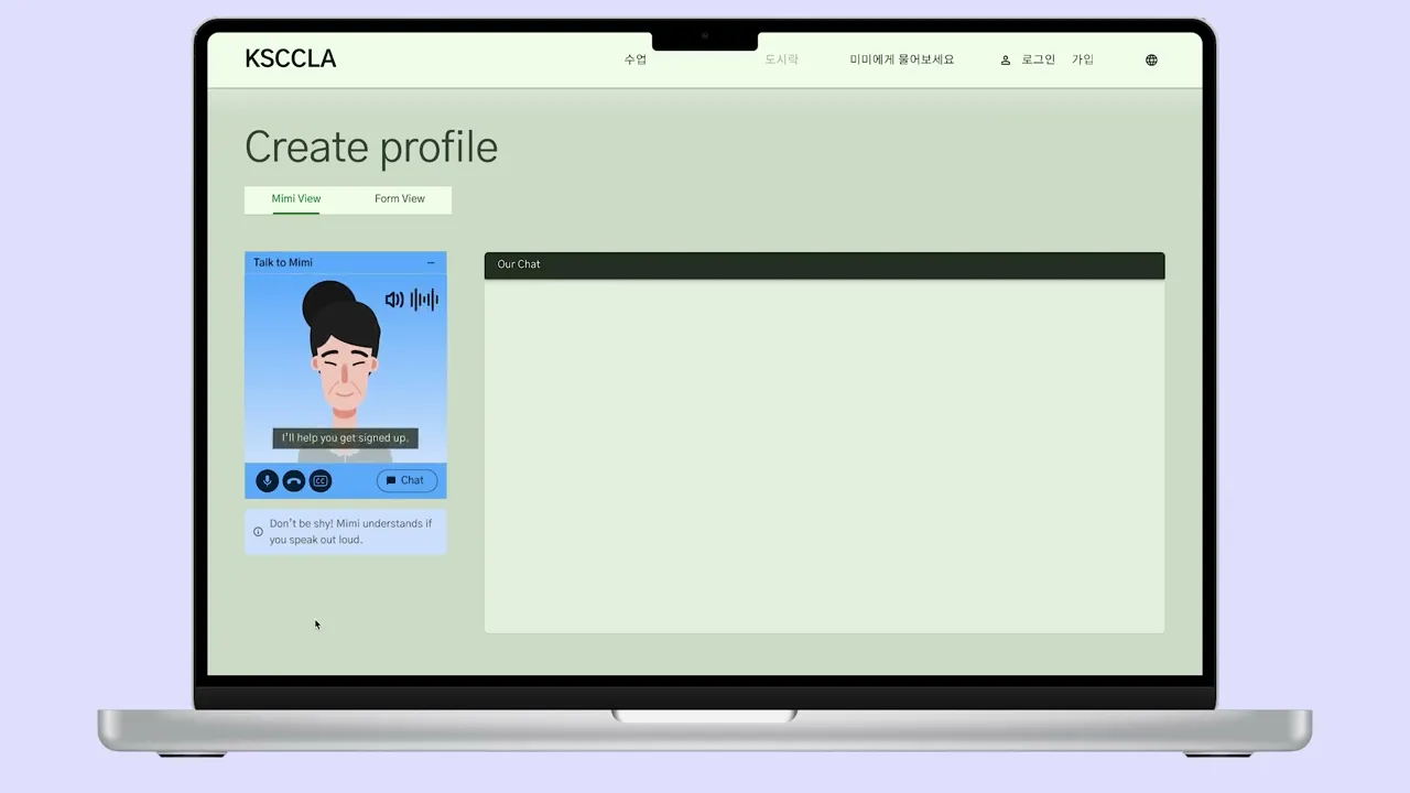
Mimi high-fidelity prototype homepage, helping seniors to intuitively find what they need at the Koreatown Senior Center.
Context
The Koreatown Senior and Community Center is an important community anchor. It provides meals, classes, social connection, and support for older adults in the neighborhood. For many seniors, it is not just a service location. It is a place where they can find routine, care, and community.
The problem is that many of the center’s systems are still heavily analog. Seniors often need to physically come in to register for classes, ask questions, check lunch availability, or get basic information. That may sound minor, but for this audience, every trip can carry real cost.
Many seniors live alone, rely on public transit, have limited mobility, or face language barriers. Some arrive as early as 2 a.m. to hold a place in line. Others travel across the city only to find that capacity is full or that the service they needed is no longer available. What should feel like access to community can become exhausting, uncertain, and discouraging.
A key turning point came when we stopped framing the project as simply helping seniors get to the center faster. The larger question was: how can seniors feel informed, supported, and able to make decisions before they leave home?
That shift changed the direction of the project. Mimi became a way to reduce uncertainty before travel, not just a digital layer on top of registration.

The Koreatown Senior and Community Center.

1 in 4 Korean seniors in L.A. live under the poverty line, and many more lack access to local community.
Research
Our research combined desk research, stakeholder conversations, journey mapping, service analysis, and concept testing. We wanted to understand how seniors currently access KSCCLA’s services, where the process breaks down, and what kind of digital support would actually feel usable to them.
The biggest insight was that the problem was not just transportation. It was uncertainty. Seniors often had to commit time, physical effort, and emotional energy before knowing whether lunch was still available, whether a class had room, or whether they could get the help they needed.
We also found that many seniors already relied on guided human support when navigating services. They called family members, volunteers, or staff to ask questions and get reassurance. That became important for the concept. The issue was not that seniors rejected help. The issue was that many existing digital systems expected them to figure everything out alone.
Key Findings:
In person registration and check-in created major friction and contributed to churn.
Many seniors had limited English proficiency and low confidence with traditional web interfaces.
Existing digital experiences were not designed around older adults’ accessibility, memory, language, and guidance needs.
Users were more comfortable when support felt conversational, direct, and human.
Lack of visibility into service status made every trip feel risky and inefficient.
Seniors needed clearer information before travel, especially around lunch availability, class registration, and support access.
These findings pushed the project away from a standard website redesign. A cleaner website alone would not solve the deeper problem. Mimi needed to act more like a guided access layer that could help seniors check, ask, and decide before making the trip.

Seniors waiting in line at the Senior Center.

1:30 a.m.
Sunja wakes up

1:45 a.m.
Eats instant ramen alone

1:50 a.m.
Walk to the bus stop in dangerous conditions

2:45 a.m.
Sit and wait for bus, hope it comes on time

3:00 a.m.
Catch bus and fend off dangerous bus riders

3:45 a.m.
Wait and hold place in line
4:45 a.m.
Continue waiting in line

10:30 a.m.
Wait for bus with no shelter
Process
The project moved through problem framing, journey mapping, concept ideation, storyboarding, wireframing, prototyping, and user testing.
Early journey mapping made the problem feel much more concrete. A senior might wake up in the middle of the night, eat alone, walk to a bus stop in unsafe conditions, wait for transit, travel across the city, and stand in line for hours without knowing whether they would actually receive lunch or get into the class they wanted. The pain was not just the trip itself. It was making that trip with so little information upfront.
We used storyboards and speculative flows to explore what remote support could look like for this audience. One early concept allowed seniors to reserve lunch boxes in advance so they would know whether the trip was worth making. After speaking with stakeholders, we learned this would not work operationally. The center used a first come, first served model to avoid food waste, and unclaimed reservations could create new problems.
That feedback forced an important pivot. Instead of designing around lunch reservation, we shifted toward real time lunch availability updates and better trip planning support. This kept the concept aligned with how the center actually operated while still reducing uncertainty for seniors.
As the concept evolved, we focused more closely on onboarding, conversation design, class registration, and the relationship between voice and screen. We explored how Mimi could guide users step by step without making the experience feel too technical or overwhelming.
Each iteration helped us simplify the flow. The final direction became more focused on meeting seniors where they were: through voice, clear visual confirmation, simple choices, and visible ways to get human help when needed.

Lunch storyboard
In this experience, there's a time block every morning for reserving lunch.

Here, Sunja places her order the night before.

We explored a daily raffle system: winners could reserve a lunch slot, while others got updates and advice on whether it was worth making the trip.

Class Registration Storyboard
Clerks advertise to seniors about the digitization of the queueing process.

Sunja onboards and chooses her language through audio.

Sunja onboards through natural language

Sunja ranks her favorite classes to be chosen in the raffle.

Sunja ranks her favorite classes to be chosen in the raffle.
Strategy
The core strategy behind Mimi was to design assistance, not just an interface. We did not want seniors to feel like they had to learn a new system before they could get help. We wanted Mimi to feel closer to a guided conversation with someone who already understood the center’s services.
This shaped the main design direction. Mimi needed to reduce uncertainty before travel, keep the next step obvious, support both voice and screen interaction, and make human backup easy to find. The system had to feel useful without feeling cold, confusing, or overly futuristic.
Design Principles:
Let seniors check important information before leaving home.
Guide users one step at a time instead of showing too many choices at once.
Use voice and screen together so each mode supports the other.
Show visual confirmation so users know what Mimi heard or understood.
Keep language simple, direct, and reassuring.
Make the option to call a real person visible throughout the experience.
Build trust through clarity, familiarity, and accessible support.
This strategy shaped the multimodal approach. Audio alone was not enough. For tasks like class registration, reading out a long list of classes or dates could create too much cognitive load. Screen only flows also failed because they assumed comfort with typing, menus, and traditional navigation.
Mimi needed both. Voice made the interaction feel more familiar and accessible. The screen provided confirmation, structure, and visual context. Together, those modes created a more supportive experience than either one could provide alone.
We also intentionally grounded Mimi in support patterns seniors already trusted, especially phone based help. The goal was not to make the center feel more futuristic. The goal was to make digital access feel approachable, culturally aware, and emotionally safe.

The current Koreatown Senior Center homepage.

Conversation example between Mimi and an elderly man.
Validation
We tested the concept across multiple stages to understand how users reacted to Mimi and where the experience still created friction.
Early testing surfaced trust issues quickly. Users felt uncomfortable when they were asked for personal details too early, especially when it was not clear why the information was needed or how it would be used. That showed us that the assistant could not assume trust. It had to earn it through timing, context, and clear explanation.
At the same time, participants responded positively to being able to speak naturally or use talk to text, especially when typing felt difficult. However, they still wanted visual confirmation of what Mimi heard. Voice made the interaction easier, but the screen made it feel dependable.
Later testing revealed additional usability issues. Too many starting options created confusion. Important next steps were easy to miss. The site hierarchy felt cluttered. Users wanted larger type, fewer decisions, clearer class information, and easier access to a real phone number.
A recurring theme was that even when users were open to digital help, they still wanted visible human backup. Mimi needed to feel like a bridge to support, not a wall between the user and the center.
Key Refinements:
Simplified the homepage and reduced competing entry points.
Made key actions more visible and easier to find.
Reduced the amount of required information early in the flow.
Strengthened visual hierarchy, contrast, type size, and readability.
Added clearer visual confirmation for voice and chat interactions.
Kept support pathways obvious, trustworthy, and close at hand.
Improved class registration flow so users could move through choices with less confusion.
The final concept became lighter, clearer, and better aligned with how seniors actually approach digital tasks. The experience was no longer asking users to navigate a system alone. It was guiding them through it.

Website homepage. Featuring the talk to Mimi service.

Talk to Mimi landing page. Options for calling on the web, text messaging, or calling on the users phone.

Calling Mimi on the web UI, featuring a chat box for conversation history.

Lunchbox registration page.

Website homepage concept featuring a simpler layout.

Second website homepage concept featuring more information.

Class registration page concept featuring a simpler layout.

Second class registration page concept featuring more visuals.
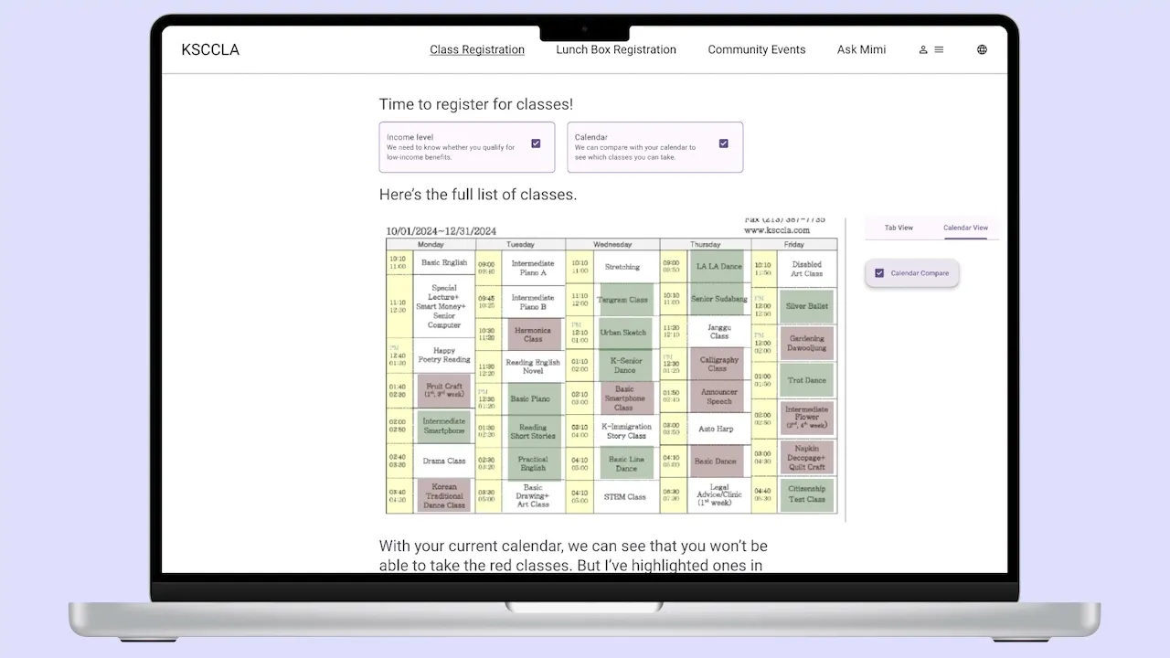
Solution
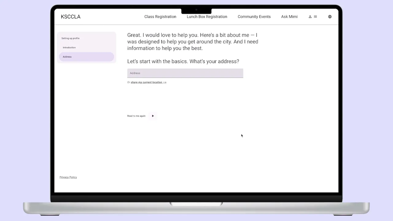
We designed Mimi as a multimodal AI assistant embedded into the KSCCLA website and broader service experience. Through voice and chat, Mimi helps seniors check lunch availability, browse classes, register for programs, and get support without relying entirely on in person visits.
The final concept focused on making service access feel guided rather than transactional. Mimi responds to what the user is trying to do, understands what is on screen, and helps move them through tasks one step at a time. Instead of dropping users into a maze of pages and forms, the system creates a clearer path through common tasks.
The assistant can support a user through the full interaction. For example, a senior can open Mimi from the homepage, choose whether to interact on the web or by phone, call Mimi, enter a code to sync the phone call with the website, and then receive guided help through a task like booking a class. Mimi can pull up the right page, ask the user to choose a class, show available dates, confirm the booking, and then close the session once the task is complete.
Just as importantly, Mimi was designed as a bridge, not a replacement. It supports the center’s existing service model while giving seniors a lower stress way to understand their options, make decisions, and prepare before traveling.
High-fidelity prototype homepage.
Key Features
Homepage Entry Point
A clear, focused prompt introduces Mimi and explains what it can help with. This makes the starting point obvious and reduces the feeling of being dropped into a confusing website.
Conversational Guidance
Mimi supports both voice and chat, allowing users to choose the mode that feels most natural. The assistant guides users step by step instead of expecting them to navigate the site alone.
Class Discovery and Registration Support
Mimi helps users understand available classes, compare options, choose dates, and move through registration in a guided way. This lowers the burden of scanning pages, reading dense information, or making sense of unfamiliar forms.
Lunch Availability Updates
Users can check current lunch status before deciding whether the trip is worth making. This responds directly to the uncertainty seniors faced around long waits, early travel, and limited capacity.
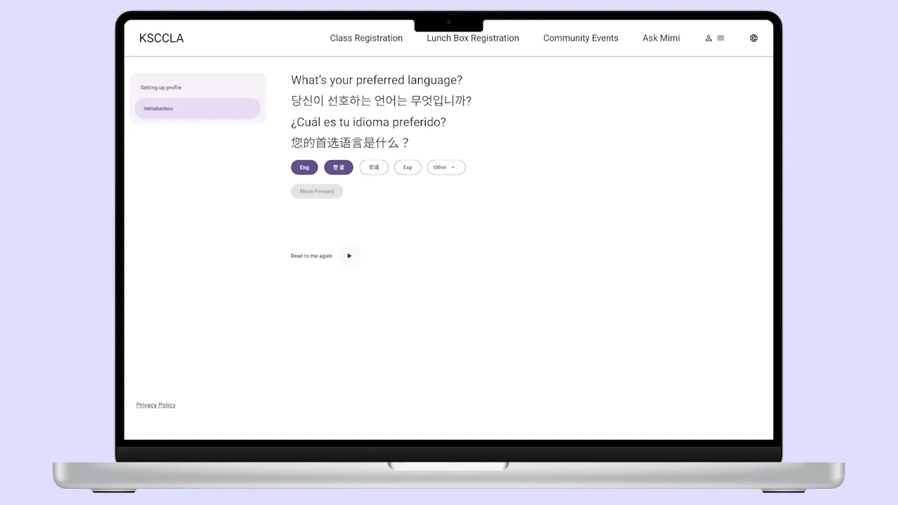
Language First and Accessibility Focused Onboarding
Mimi supports different comfort levels with language and technology through voice, subtitles, visual feedback, and simplified flows. The experience is designed around guidance, not speed or technical efficiency alone.
Phone and Web Sync
Users can call Mimi on their phone while still receiving visual support on the website. A simple code connects the phone interaction to the web interface, letting voice and screen work together.
Persistent Help and Human Backup
Support stays visible throughout the experience, including clear ways to call the center or get additional help. This was important because users still wanted to know a real person was available if the digital system did not solve the problem.
Together, these features positioned Mimi as more than a chatbot. Mimi became a service layer built around actual operational constraints, senior behavior, language needs, and trust barriers.

Website homepage, featuring a pop-up screen to interact with Mimi.

Using the pop-up, the user can choose how they want to interact with Mimi. In this example, the user gets instructions on how to call Mimi on their phone.

Once the user calls Mimi, they input a code to sync the website UI with the call.

When a user wants to book a class, Mimi pulls up the class registration page and asks the user to pick the class they want.

Then Mimi pulls up the website calendar and asks the user which class date they would like to book.

Once the class is booked, Mimi pulls up a confirmation page and information on their booking. Once the users needs are met, they can just hang up the call and Mimi will close.
Results
The final Mimi concept tested significantly better than the existing website experience.
Key Outcomes:
100% of participants preferred the final Mimi flow over the current website.
80% said booking classes with Mimi felt intuitive and was the simplest option.
60% naturally chose Mimi instead of manually navigating the site.
Critical tasks like class registration and support became easier to self serve.
The final flow felt more approachable and trustworthy for older users.
The strongest signal was that participants were not just completing the flow. They were choosing Mimi over the existing site. That suggested the guided interaction was reducing the intimidation of digital self service and making the experience feel more manageable.
The testing also reinforced the value of multimodal interaction. Voice helped users interact more naturally, while the screen gave them confirmation, structure, and confidence. For this audience, the combination mattered.
More importantly, the project showed that AI could be useful in this service context when it was designed carefully. Mimi was not valuable because it was AI for its own sake. It was valuable because it helped seniors ask questions, check information, complete tasks, and feel less uncertain before traveling.
Mimi access popup on the prototype homepage.
Impact
Mimi changed the frame of the project from “how do we digitize registration?” to “how do we make service access feel available before someone arrives?”
That shift led to a stronger design direction. Rather than layering new technology onto an already confusing system, Mimi proposed a more supportive access model. It helped users understand what was available, decide what to do, and act with more confidence.
For seniors, the value was practical. Mimi could reduce unnecessary trips, make class registration easier, provide lunch updates before travel, and create a clearer path to help. For the center, the concept suggested a way to expand access without removing the human support that makes the organization valuable.
At a broader level, Mimi points toward how community organizations can use multimodal assistance to support older adults and other vulnerable communities. The opportunity is not to replace staff or make services feel automated. It is to give people more ways to reach support, especially when current systems require too much effort, uncertainty, or in person dependence.
The project also helped show that accessible AI needs to be grounded in real service conditions. For Mimi, that meant designing around language needs, trust, operational constraints, phone based behavior, and the emotional reality of asking for help.
What I Learned
This project taught me that strong UX in service contexts depends on much more than interface clarity. It requires understanding emotional state, trust, language, mobility, cognitive load, and the larger systems around the experience.
One of the biggest lessons was how much stronger the solution became once the problem was reframed correctly. When we shifted from improving attendance to designing for presence, the project became sharper and more meaningful. It opened the door to a solution that was not just more efficient, but more humane.
I also learned how important it is to test the assumptions behind a concept, not just the screens. The lunch reservation idea sounded helpful at first, but stakeholder feedback showed that it would not work with the center’s first come, first served model. That constraint pushed us toward real time availability instead, which made the concept more realistic.
Another major lesson was that voice interaction is strongest when it is supported by visual confirmation. Voice made Mimi feel approachable, but the screen helped users feel sure of what was happening. For older adults, that reassurance matters.
This project helped me understand that good design is often about reducing fear, confusion, and uncertainty. In Mimi, the goal was not just to make tasks faster. It was to make seniors feel more supported before taking action.
Reflection
Mimi is one of the projects that most clearly shaped how I think about design. It pushed me beyond interface work and into service design, accessibility, systems thinking, and emotional experience.
What made the project meaningful was the real human problem underneath it. Seniors were not just dealing with inconvenient registration flows. They were waking up early, traveling long distances, waiting in line, dealing with language barriers, and making stressful decisions with limited information. That context made the design work feel more important.
I am proud that the final concept did not treat AI as a flashy feature. Mimi was designed around a simple need: help people check, ask, and act before they make a difficult trip. The technology only made sense because it was grounded in a real service environment and a behavior users already trusted.
If developed further, Mimi could become a meaningful service layer for organizations that support older adults and other vulnerable communities. The next step would be testing it more deeply with seniors, staff, and real service conditions to understand how it would affect workload, trust, accessibility, and long term use.
Overall, Mimi reinforced the type of designer I want to be: someone who looks past the obvious interface problem and tries to understand the full experience around it. In this project, the real opportunity was not just making a better website. It was helping people feel less alone, less confused, and more supported before they had to leave home.

