Overview
Lived is a mobile app concept that helps early career adults turn vague intentions into real experiences through personalized discovery, planning support, lightweight reflection, and a private archive.
The project began as a capstone thesis about intentional living. Through research and three rounds of testing, I found that users did not need another inspiration feed. They needed help choosing, planning, committing, and following through. The final prototype evolved into a fuller intentional living system with personalized recommendations, commitment tools, Receipts of Life, Life Wrapped insights, and a private archive of meaningful moments.
The project ended as both a high-fidelity mobile prototype and a public graduation exhibition where visitors could reflect, try the product, and take home real experience prompts.
Why I Made This
A lot of the best parts of my life came from saying yes to something unfamiliar.
When I was 18, I moved from Chicago to Los Angeles. I knew no one, had very little money, and mostly followed a feeling that it was something I needed to do. I ended up in Venice, living in a creative house, meeting people I never would have met otherwise, and stepping into experiences that changed the direction of my life.
Over time, I noticed a pattern. The most memorable parts of my life usually did not come from staying comfortable. They came from trying something new, going somewhere unfamiliar, meeting new people, taking risks, and following curiosity before I had every detail figured out.
Those choices gave me memories, confidence, opportunities, and a clearer sense of who I was becoming. Lived came from wanting to design for that kind of movement: the moment where someone stops waiting for “someday” and actually steps into a fuller version of their life.

Prototype mockup showing Lived’s personalized experience discovery in a real world context.

Personal origin slide showing how moving to LA and living in Venice shaped the project.
Context
After choosing this problem space, I wanted to understand why the gap between wanting a fuller life and actually living one felt so common.
One idea that helped frame the project was the fact that an average life is only around 4,000 weeks. Once time is divided between sleep, work, school, errands, commuting, eating, and basic responsibilities, the amount of truly open time becomes much smaller than it feels.
That made free time an important part of the project. In 2024, Americans aged 15 and older spent an average of about five hours per day on leisure activities, with 2.60 of those hours spent watching TV. The point was not that TV is bad, or that every hour needs to be productive. The point was that people often have some discretionary time, but that time can easily disappear into passive routines instead of becoming the kind of experiences they say they want.
This helped define the opportunity for Lived: design a product that helps people turn limited free time into experiences that feel personally meaningful, without framing life as another thing to optimize.
Design Challenge
The initial design challenge was to find a problem I was personally passionate about, could clearly see in the world, and could meaningfully address through interaction design.
For me, that problem became the gap between the life people imagine for themselves and the life they actually live day to day. I wanted to explore why people often want more memorable, meaningful, and experience-rich lives, but still fall into routine, passive defaults, and “someday” thinking.
From there, the challenge became designing a product that could help people move from vague desire into real action without making intentional living feel like another productivity system.

The 4,000 weeks visualization frames how limited free time becomes over a lifetime.

The gap between many people's current leisure habits and desired experiences.
Research
The research for Lived had three main parts: behavioral science research, competitive research, and a digital signal scan. Together, these helped me ground the concept in more than personal intuition.
Behavioral Science Research
I looked at research around experiences, anticipation, novelty, memory, regret, follow-through, and narrative identity. The biggest takeaway was that experiences are not just fun extras. They can shape happiness, memory, identity, and how people understand their own lives.
Research on experiential purchases suggests that experiences are often remembered more positively, become part of identity, and carry more social value than material purchases. For Lived, this meant the product should stay centered on real world action, not digital rewards, badges, or abstract goals.
I also found that anticipation is part of the payoff. Looking forward to an experience can be rewarding on its own, which made planning more than a logistics problem. The planning flow needed to make the experience feel closer, more real, and worth looking forward to.
The research on psychological richness and novelty helped define the target user. A psychologically rich life is built through varied, interesting, and perspective-changing experiences, and novelty is connected to motivation, life satisfaction, attention, and memory. That supported designing Lived for someone who values aliveness, openness, and expansion.
The regret research connected directly to the “someday” problem at the center of Lived. People may regret actions more in the short term, but in the long term they often regret missed opportunities and things they did not do.
Finally, narrative identity research helped validate the archive. If people make sense of themselves through the stories they build about their lives, then the archive is not just a place to store photos. It can help users see who they are becoming through the experiences they actually choose.
Competitive Research
I looked at adjacent products that overlap with different parts of Lived, including The Nudge, Wanderlog, Polarsteps, Day One, Daylio, BucketList, and Finch. Each product solved part of the problem, but none solved the full loop.
The Nudge showed the value of curated recommendations. Wanderlog showed the value of making plans concrete and visual. Polarsteps and Day One showed the emotional value of memory and private life capture. Daylio showed that reflection needs to stay fast and lightweight. Finch showed how much tone matters when a product deals with personal motivation.
The strongest gap I found was fragmentation. Existing products help people discover activities, organize logistics, journal, track moods, document travel, or list goals. But I did not find a strong product that connected meaningful discovery, commitment, follow-through, reflection, and memory into one system.
That became the whitespace for Lived: a product built around the full loop of intentional living through experience. Find it, commit to it, do it, remember it, and build from it.
Digital Signal Scan
I also looked at Reddit, forums, App Store reviews, and online discussions where people talked more honestly about boredom, autopilot, wasted time, and wanting more from life.
The language people used was direct and emotional. People described “just existing instead of living,” feeling like life was passing by, living on autopilot, falling into “Groundhog Day,” and wondering what they were doing with their life.
This helped sharpen the tone of the project. The problem was not just organization or boredom. It was a deeper feeling that life can become repetitive, passive, and under lived.
The digital signal scan also showed that people do not want a huge generic list of options. They want curation, relevance, and help making something real. That directly shaped the product direction. Lived should not feel like Eventbrite, Yelp, Pinterest, or a bucket list. It should feel like a tool for living.

Process
The process started with identifying and framing the problem, then moved into research, journey mapping, prototype development, testing, iteration, and public exhibition.
I mapped the user journey around the main use case: a young adult feels stuck in routine, opens Lived because they want something more meaningful out of their week, chooses an experience, follows through, and captures it as part of a growing archive.
The journey map helped identify three key risk points in the experience.
The first was recommendation quality. If suggestions felt generic, unrealistic, or out of touch, trust would drop quickly. The second was commitment. Even if a user liked an idea, that did not mean they would actually do it, so the product needed to create a stronger bridge between interest and action. The third was reflection. If the post-experience step felt too heavy, users would skip it, so reflection needed to be lightweight but still meaningful.
The emotional arc also became clear: restlessness, curiosity, hope, commitment, presence, pride, and momentum. That arc helped shape the tone of the product. Lived is not only a utility tool. It is designed to shift how users feel about their own life and the choices available to them.
MVP Scope
For the MVP, I focused on proving the core loop: can a user move from vague desire, to a recommended experience, to commitment, to reflection, to archive?
The MVP included onboarding, personal input, curated recommendations, experience detail pages, a commitment flow, Receipt of Life capture, a private archive, and a return loop.
I intentionally kept out full social features, public sharing, real booking or payment systems, heavy journaling, and broad life management tools. The goal was to prove the smallest complete version of the behavior change loop: helping someone move from vague desire into a real experience, then making that experience visible and worth remembering afterward.


This flow shows how the early product concept moved users from input to commitment.
Strategy
The first major design decision was to define Lived around a loop instead of a feed.
A feed of ideas would have been easier to build, but it would not solve the real problem. The research kept pointing back to the same issue: discovery alone is not enough. People need help moving from inspiration into action, then turning that action into memory and momentum.
The core loop became Discover, Commit, Do, Reflect.
Discover helps users find experiences that fit their interests, mood, energy, budget, time, and desired level of challenge.
Commit turns intention into a real plan with enough detail to make follow-through feel possible.
Do is the actual outcome of the product: completing the experience in real life.
Reflect captures the experience as a Receipt of Life and adds it to a private archive that shows momentum over time.
Design Principles
The final design principles were:
Help users act, not just aspire.
Make recommendations feel curated and personal.
Keep the flow low-friction.
Make planning feel motivating, not administrative.
Keep reflection lightweight but meaningful.
Treat the archive as core value, not storage.
Design for aliveness, not productivity.
These principles helped keep the product from drifting too far into either self-help language or pure utility.
Privacy and Trust
Because Lived deals with personal memories, locations, reflections, and the way users spend their lives, privacy had to be part of the product direction. The MVP is private by default. There is no public social feed, and the archive is treated as a personal record, not content for performance.
That was important to the tone of the product. Lived should help users build a life that feels more intentional, not turn their life into another social platform.

Core loop diagram showing how Lived moves users through discovery, commitment, action, and reflection.
Validation
Lived was shaped through three rounds of testing: early concept testing, guided reflection interviews, and high-fidelity prototype testing.
Across all rounds, the concept was easy for people to understand. The more important question was whether it could move from a compelling idea into a useful product. Each round helped sharpen that direction.
Round 1: Early Concept Test
The first test focused on whether the basic idea and flow made sense. I tested an early prototype with three people.
The concept landed quickly. Participants moved through the flow without much confusion and understood that the app was trying to help them choose something more meaningful to do with their week. The short flow worked because it was simple and not overwhelming.
The main weakness was recommendation quality. Participants understood the idea, but the suggested experiences needed to feel more personal, specific, and believable.
This gave me the first major design direction: the product could not rely on broad inspiration. It needed stronger personalization and clearer reasons behind recommendations.
Round 2: Guided Reflection Interviews
The second round was a 1:1 moderated interview study with four people. The goal was to validate the problem, not just the interface.
I wanted to know whether young adults related to the core tension behind the project: wanting a fuller, more intentional life, but falling into routine, convenience, fatigue, and low-effort habits. The interviews started with current routines, then moved into unmet desires, aspirations, barriers, and reactions to the concept.
This round produced one of the most important insights in the project: the gap was not lack of desire. Participants wanted more travel, music, nature, social connection, creativity, adventure, challenge, and memorable experiences. The bigger issue was turning those desires into action.
One participant described it clearly: “It’s not so much as not knowing how to, but feeling like I don’t have the bandwidth to.” That quote changed the product direction. Lived could not just help people dream. It had to reduce the effort required to act.
The interviews also showed that meaningful experiences are personal. Participants described meaning through music, nature, family, contribution, travel, relationships, creativity, connection, challenge, identity, confidence, and becoming more fully themselves. That meant the product could not assume one universal definition of “meaningful.” It had to help users define that for themselves.
The reflection prompts also validated the value of reflection. Participants became more articulate as the conversation went on and surfaced things they had not fully named before. But the clearest takeaway was still action. One participant summed up the value of the concept in one line: “It makes it actionable.”
After this round, onboarding became more important, recommendation inputs expanded to include time, energy, budget, mood, social setting, and comfort zone, and the product language became more direct. Most importantly, the project shifted from helping users imagine a fuller life to helping them act on one.
Round 3: High-Fidelity Prototype Test
The third round tested the high-fidelity prototype with five participants. This test evaluated whether the product was clear, relevant, and actionable.
The prototype tested onboarding, the home experience, discovery, choosing an experience, commitment, archive/journaling, Life Wrapped, and overall concept clarity.
The concept still landed strongly. Participants understood the product quickly and described it as something that helps people live more intentionally, break out of routine, and do more meaningful things with their life.
Participants said things like, “This feels like something that could actually make people think bigger about their life,” “This feels like it’s about actually living your life, not just organizing it,” and “This feels bigger than just events or recommendations.” That validated the positioning. The product was not being read as just another event discovery app.
Onboarding also worked well. Participants said it made the product feel personal rather than generic and helped frame the app around a larger life question before asking users to browse recommendations.
The archive and Life Wrapped were strong differentiators. Participants liked that experiences would become part of a larger personal record, shifting the product from activity discovery into a system for seeing a life being built over time.
The main failure point was after selection. Across all five participants, users liked the inspiration, but wanted more help making the experience happen. They asked for cost, time required, location, transportation context, what to bring, effort level, best time to go, social context, preparation steps, a first next step, and clearer commitment.
This was the biggest turning point in the project. The prototype was strong at helping users imagine more. It needed to become stronger at helping them execute.
Participants said things like, “Once I pick something, I want the app to tell me how to actually make it happen,” “After I choose something, I want it to give me the roadmap,” and “I need the app to help me after I pick the thing.”
That feedback directly shaped the final prototype.

Test 1: Early prototype testing focused on whether the basic concept and flow were clear.
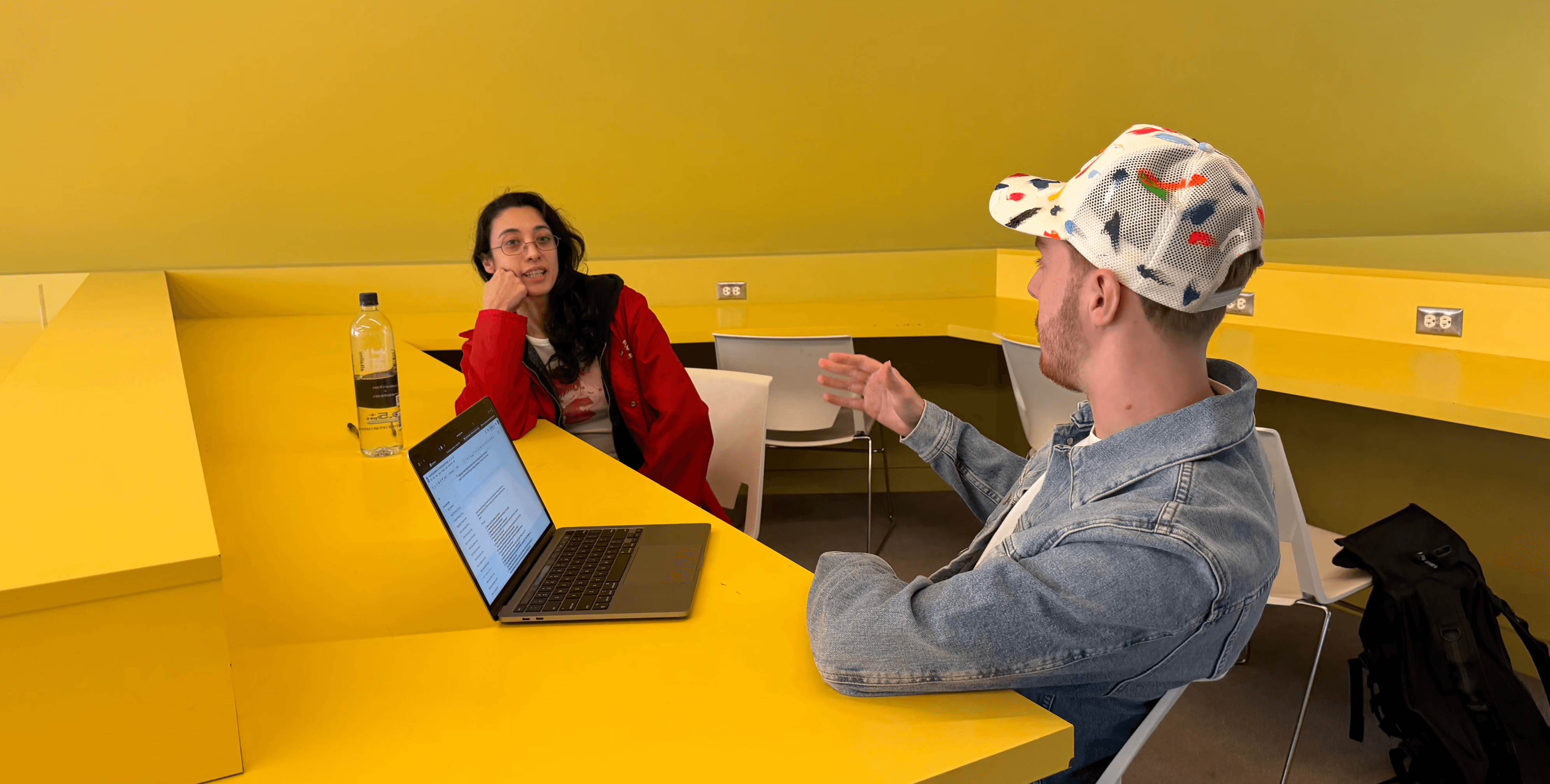
Test 2: Guided reflection interviews helped validate the problem and uncover barriers to follow through.

Test 3: High-fidelity prototype testing revealed the need for stronger planning support after users selected an experience.
Solution
The final prototype is organized around one core flow: Choose, Explore, Commit, Do, Reflect, and Archive. Each stage moves the user closer to a real experience, then helps them remember what it meant afterward.
Choose: Onboarding
The experience starts with onboarding. Instead of immediately showing generic recommendations, Lived asks users what they want more of in life. This includes interests, energy, budget, comfort zone, social preferences, and the kinds of experiences that make them feel alive.
This came directly from research showing that meaningful experiences are subjective. The app cannot assume one definition of a good life. It has to help users define that for themselves.
Explore: Personalized Discovery
After onboarding, users receive curated experience recommendations designed to match their real context or gently stretch their comfort zone.
The final prototype includes stronger discovery controls because testing showed that users needed more ways to narrow down options. Filters include budget, time, effort, mood, social setting, and experience type.
Mood-based search lets users describe what they want in more natural language, like “something relaxing near the beach” or “something weird to do with friends this weekend.” This makes the product more flexible without turning it into a generic search engine.
Commit: Planning and Follow Through
Once a user chooses an experience, Lived helps make it real. This is where the final prototype improved most after testing.
Each experience page includes what it is, why it fits, estimated cost, time, location, effort level, best time to go, what to bring, and clear next steps. The goal is to lower friction so the user leaves the flow knowing what the experience requires and what to do first.
This is the point where Lived becomes more than inspiration.
Do: The Real World Experience
The real outcome of Lived happens outside the app. The product is not designed to keep users scrolling. It is designed to help them leave the interface and actually do the thing they committed to.
The app supports that moment with planning context, reminders, and commitment, but the product only works if it leads to a real-world experience.
Reflect: Receipts of Life
After completing an experience, the user creates a Receipt of Life: a lightweight reflection artifact that captures what happened and why it mattered. It can include a short video or photo, a one-line reflection, and simple dimensions like aliveness, meaning, and growth.
This keeps reflection from becoming homework. The goal is to capture enough meaning that the moment becomes easier to remember and revisit.
Archive: Memory, Patterns, and Life Wrapped
The receipt is saved into a private archive. Over time, those receipts build into a record of the user’s life.
The archive shows completed experiences, media, reflections, patterns, stats, and emotional data over time. Life Wrapped turns those moments into recap insights, such as top moments, new things tried, places explored, awe moments, comfort zone expansion, chapter progress, and reflection patterns.
This is the long-term value of the product. It turns individual experiences into memory, identity, and momentum.


Key Features
Personalized Onboarding
The onboarding flow helps users define what they want more of before the app recommends anything. It asks about interests, energy, budget, comfort zone, social preferences, and the kinds of experiences that feel meaningful to the user.
Curated Experience Discovery
Lived gives users a curated set of experiences instead of a giant open feed. Recommendations are designed to feel specific, believable, and worth doing.
Filters and Mood Based Search
Users can filter experiences by budget, time, effort, mood, social setting, and experience type. They can also search based on what they are in the mood for, helping the product feel more personal and realistic.
Experience Detail Pages
Experience detail pages include what the experience is, why it fits, estimated cost, time, location, effort level, best time to go, what to bring, and clear next steps. This is the main bridge between inspiration and action.
Commitment Flow
The commitment flow turns a possible experience into a real intention. Instead of simply saving an idea, the user decides to do it and sees what it will take to make it happen.
Receipts of Life
Receipts of Life are lightweight post-experience reflections. They let users capture a short video or photo, write a one-line reflection, and rate how alive, meaningful, or growth-oriented the experience felt.
Private Archive
The archive shows completed experiences, media, reflections, patterns, stats, and emotional data over time. It turns individual moments into a visible record of a more intentional life.
Life Wrapped
Life Wrapped gives users recap insights across their experiences, including top moments, new things tried, places explored, awe moments, comfort zone expansion, chapter progress, and reflection patterns.
Challenge Modes
The product explored different intensity levels for experiences: Steady, Bold, and Wild. This idea later became part of the physical exhibition through the mystery experience card exercise, where visitors could pick a Wild, Bold, or Chill card and take an experience prompt with them.
Full Lived prototype flow, showing all the core areas and features of the app.
Results
The final result was both a digital product concept and a physical thesis exhibition.
By the end of the project, Lived had evolved from a broad concept about meaningful experiences into a tested product system built around the full Discover → Commit → Do → Reflect loop.
Final outputs included a high-fidelity mobile prototype, onboarding flow, experience discovery flow, experience detail pages, commitment flow, Receipt of Life capture, private archive, Life Wrapped screens, concept website, presentation deck, research synthesis, testing documentation, and full grad show exhibition system.
The project included three testing phases: an early concept test, four guided reflection interviews, and five high-fidelity prototype tests. Across those rounds, I tested concept clarity, problem relevance, recommendation quality, actionability, emotional value, and whether the product felt meaningfully different from existing discovery tools.
The clearest result was that Lived became stronger when it moved from inspiration into follow-through. Testing directly led to stronger planning support, better filters, clearer commitment, more grounded language, and a more useful archive.
Key Iterations
Testing did not just confirm the concept. It changed the product. The biggest shift was that Lived became less of an inspiration tool and more of a system for choosing, planning, doing, and remembering meaningful experiences.
1. From Inspiration to Planning Support
Users liked the experience ideas, but after choosing one, they still did not know exactly what to do next. In response, I added a deeper planning layer to each experience page, including cost, time required, location, what to bring, effort level, best time to go, and clear next steps.
This moved Lived from “that sounds cool” toward “I can actually do this,” making it one of the most important improvements in the final prototype.
2. From Broad Discovery to Better Controls
Testing showed that recommendations could feel too broad because users had different budgets, moods, schedules, comfort levels, and definitions of what felt meaningful. I added filters for budget, time, effort, mood, social setting, and experience type, plus a mood-based search input where users could describe what they were looking for.
This made discovery feel more realistic and personal instead of treating every user as if they wanted the same kind of life.
3. From Saving Ideas to Committing
Choosing an experience risked feeling too close to saving something for later, which did not fully solve the follow-through problem. I made commitment a clearer product moment, where the user is not just liking an idea but deciding to do it and seeing what it will take to make it real.
This addressed the main behavioral gap between intention and action.
4. From Storage to Life Archive
The archive had emotional potential, but it needed to feel more valuable than a folder of completed activities. I expanded it to include completed experiences, reflection data, patterns, stats, experience categories, Life Wrapped insights, and visual memory cards.
This made the archive feel like proof of a life being built over time, turning isolated moments into visible momentum.
5. From Abstract Language to Clearer Framing
Some language around “meaningful experiences” and an “experience-rich life” felt broad until the product defined those ideas through action. I leaned into clearer phrases like “Turn intention into real experience,” “Build a life worth remembering,” and “The real problem is not desire. It is follow-through.”
This made the tone emotional without becoming vague and helped the product feel more direct, grounded, and usable.

Testing led to stronger planning support, better discovery controls, and a more useful archive.
Graduation Exhibition
The graduation exhibition became a major part of the final project because it turned Lived from a digital product concept into a physical experience and public validation environment.
I designed the exhibit to get visitors into the same headspace as the app. I did not want people to only read about intentional living. I wanted them to reflect, choose, and interact with the idea themselves.
The final exhibition included a Lived title wall, process posters, a sticky note reflection wall, two iPads running the prototype, a laptop showing the concept website, a QR code to the live prototype, and a mystery experience card exercise with Wild, Bold, and Chill prompts. The space used black backing boards against the yellow built-in desks and wall, matching the product’s dark, cinematic, yellow-gold visual system.
Sticky Note Wall
The sticky note wall asked: “What’s an experience that made you feel most alive?”
This became one of the most active parts of the exhibit. Many visitors walked up to it first, wrote their response, and then asked me to explain the project. I expected the prototype or card exercise to be the first interaction, but the simplest reflective prompt became the easiest way into the concept.
Prototype Stations
The iPads let visitors try the product directly. One prototype started with onboarding so visitors could see how the app learns about the user, while another let them move faster into browsing, committing, and reflecting.
Visitors were especially interested in the experience suggestions and often wanted to see the full onboarding flow. I frequently reset the prototype so they could experience the product from the beginning, which helped prove that onboarding was one of the clearest ways to communicate the concept.
Mystery Experience Cards
The card exercise was a physical version of the Lived experience model. Visitors could choose from over 100 unique Wild, Bold, or Chill cards, each giving them a real experience prompt to consider doing.
Some cards were adventurous, like skydiving, paragliding, scuba diving, or booking a last-minute overnight trip. Others were more social, creative, or reflective, like going to a jazz bar, taking a class, doing a museum day, booking a Korean spa day, or watching the sunset at the beach.
The point was not just to give visitors a fun takeaway. It was to make the project immediate. The card asked them to choose something and imagine actually following through.
Website
I also created a published concept website for Lived. The website explained the project, the problem, the prototype, and the bigger vision behind the app. It gave visitors another way to explore the concept if they wanted more depth after seeing the exhibit.
Exhibition Feedback
Visitor feedback was strong. One visitor said, “This actually makes me want to go try something new this week.” Another said, “I would definitely download this if it were real.”
Visitors connected with the project because the physical experience made the idea personal. They could reflect on a memory, try the prototype, pick a challenge card, and imagine a new experience for themselves.
What the Exhibition Proved
The exhibition showed that the concept works best when people can participate in it. The sticky note wall helped visitors reflect, the prototype helped them understand the product, the cards helped them choose, and the website gave them a way to go deeper.
Together, the exhibit turned Lived from a digital app concept into a full experience around living more intentionally. It also showed that Lived does not have to live only on a screen. The idea could extend into physical prompts, social spaces, events, card decks, and real-world activations that help people take action.

Full exhibition setup showing the physical Lived experience.

Sticky note wall where visitors reflected on what made them feel alive.
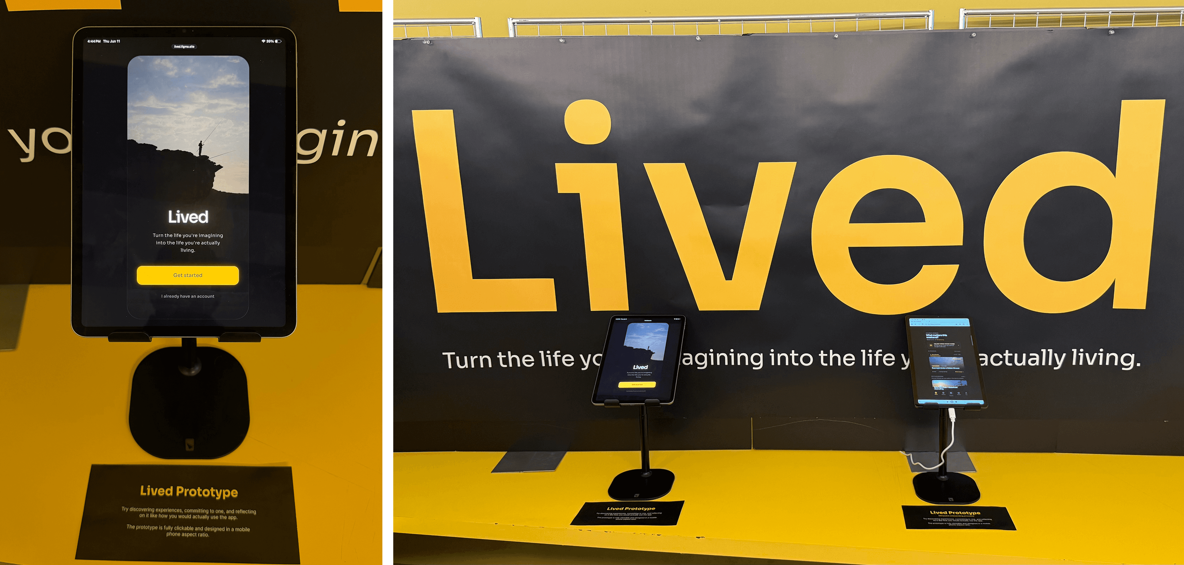
Prototype station where visitors tested the Lived app flow.

Challenge cards that gave visitors real experience prompts to take home.
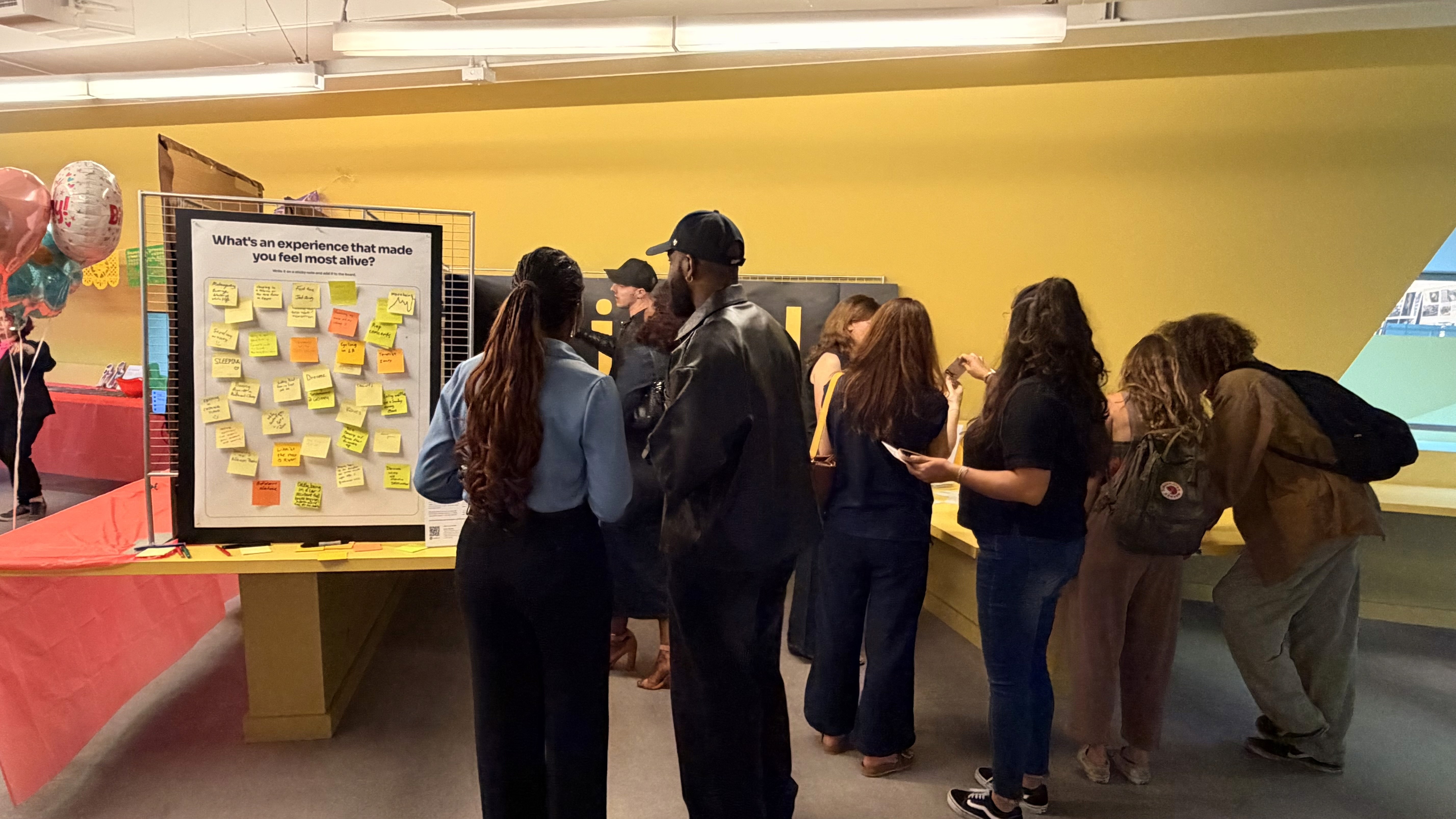
Lots of visitors engaging with the Lived reflection wall during the graduation exhibition.
Impact
Because Lived was a capstone concept, its impact is not measured like a launched product. Instead, the project created impact in four clear ways: user validation, product development, exhibition response, and future product opportunity.
User Validation
Across testing, people consistently recognized the problem. Participants understood the gap between wanting more from life and actually following through. They did not just describe the idea as interesting. They described how it could help them choose, prioritize, plan, and act on experiences they already cared about.
Product Development
The product evolved significantly through research and testing. It started as a concept about meaningful experiences and became a more complete system for intentional living. The most important change was the planning layer after experience selection, which turned the prototype from an inspiring concept into something more actionable.
Exhibition Response
The grad show proved that the concept could connect with people quickly in a public setting. Visitors engaged with the sticky note wall, tried the prototype, picked challenge cards, scanned the website, and asked questions about how the product worked. The strongest response came from the interactive parts of the exhibit because they let people reflect on their own lives instead of only reading about the product.
Product Opportunity
Lived has potential beyond a school prototype because it addresses a real behavioral gap. The long-term opportunity is not just helping people find things to do. It is building a system that helps people live more intentionally through discovery, planning, memory, reflection, and real-world action.
Future Direction
If Lived continued beyond the capstone, I would build it as a mission driven nonprofit focused on improving quality of life through intentional experiences. The goal would not be to maximize screen time, push endless content, or turn people’s lives into another performance space. The goal would be to help people spend more of their limited time on experiences that create memory, confidence, connection, growth, and a stronger sense of being alive.
The first version would focus on Los Angeles. An LA-first pilot makes sense because the city has the right mix of culture, nature, events, neighborhoods, nightlife, creative communities, and day trip opportunities. It also has a real planning problem: distance, traffic, cost, parking, social coordination, and decision fatigue can make even good ideas hard to follow through on.
The next step would be an LA-specific MVP with onboarding, local recommendations, filters, planning details, commitment tools, and a simple archive. From there, I would test it with a small group of users and measure whether people actually complete experiences after committing to them.
If the pilot worked, Lived could grow through partnerships with local experience providers, cultural institutions, parks and recreation groups, schools, wellness organizations, and community nonprofits. These partnerships could reduce cost, improve access, and make the product more useful for people who want realistic ways to live more intentionally.
Long term, Lived could expand city by city with local curation, local partnerships, and recommendations that actually fit each place. The most important next step would be measuring real follow-through. The key question is not whether users like the idea. Testing already showed that they do. The real question is whether Lived can help people do more of the experiences they say matter to them.

App screens showing the home, explore, and archive experiences.
What I Learned
This project taught me that a strong product concept needs both emotional truth and practical usefulness.
The emotional truth behind Lived is that many people do want to live more fully. They think about the things they have not done, the routines they fall into, and the life they imagine for themselves. But emotional truth is not enough. A product has to help at the moment where behavior breaks.
For Lived, that moment came after selection. Users could be inspired by an experience, but still need help with cost, time, transportation, preparation, social context, and the first step. That became the most important design lesson from the project.
I also learned that reflection is powerful when it is simple. People liked the archive and Life Wrapped, but that does not mean they want to write long journal entries after every experience. The reflection flow has to be lightweight enough to sustain.
Another major lesson was that personalization has to be believable. If recommendations feel generic, users lose trust quickly. For a product like Lived, relevance is everything.
The exhibition taught me that physical interaction can make a digital concept easier to understand. The sticky note wall and card exercise helped people enter the project emotionally before they ever touched the prototype.
That changed how I think about product storytelling. Sometimes the best way to explain an app is not another screen. It is a simple prompt that helps the user feel the problem for themselves.
Reflection
Lived is one of the most personal projects I have made, but it also became one of the most research-driven.
It started from my own experience of seeing how much my life changed when I tried new things, moved to new places, and followed unfamiliar opportunities. But the project became stronger when I tested that idea through research, real users, competitor patterns, and public exhibition feedback.
What I am most proud of is that Lived did not stay at the level of a vague motivational message. Through testing, it became a specific product system built around discovery, commitment, planning, reflection, and memory.
The strongest part of the final concept is the full loop. Lived helps users find something meaningful, make it real, do it, capture it, and see those moments build over time. That loop is what makes the product different from a recommendations app, journal, planner, or bucket list.
The biggest shift in the project was realizing that inspiration is not enough. Follow-through is the real product problem. Lived became stronger when I stopped designing only for activity discovery and started designing for the moment where people usually drop off.
People do not just need more ideas. They need help turning the life they keep imagining into the life they are actually living. That is what this project was built to do.